Brand Development
Juntas, 2021
Brand Development
F&B
Phase 1: Concept Development & Strategy/ Phase 2: Visual Identity Development/ Phase 3: Brand Application & Collateral Design
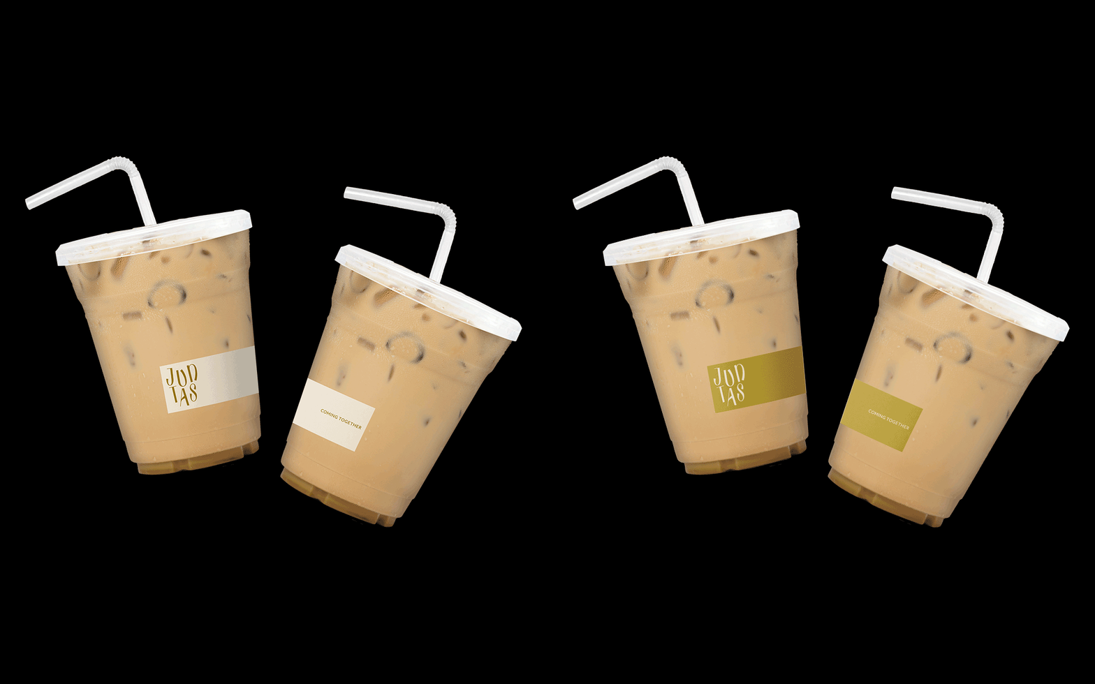
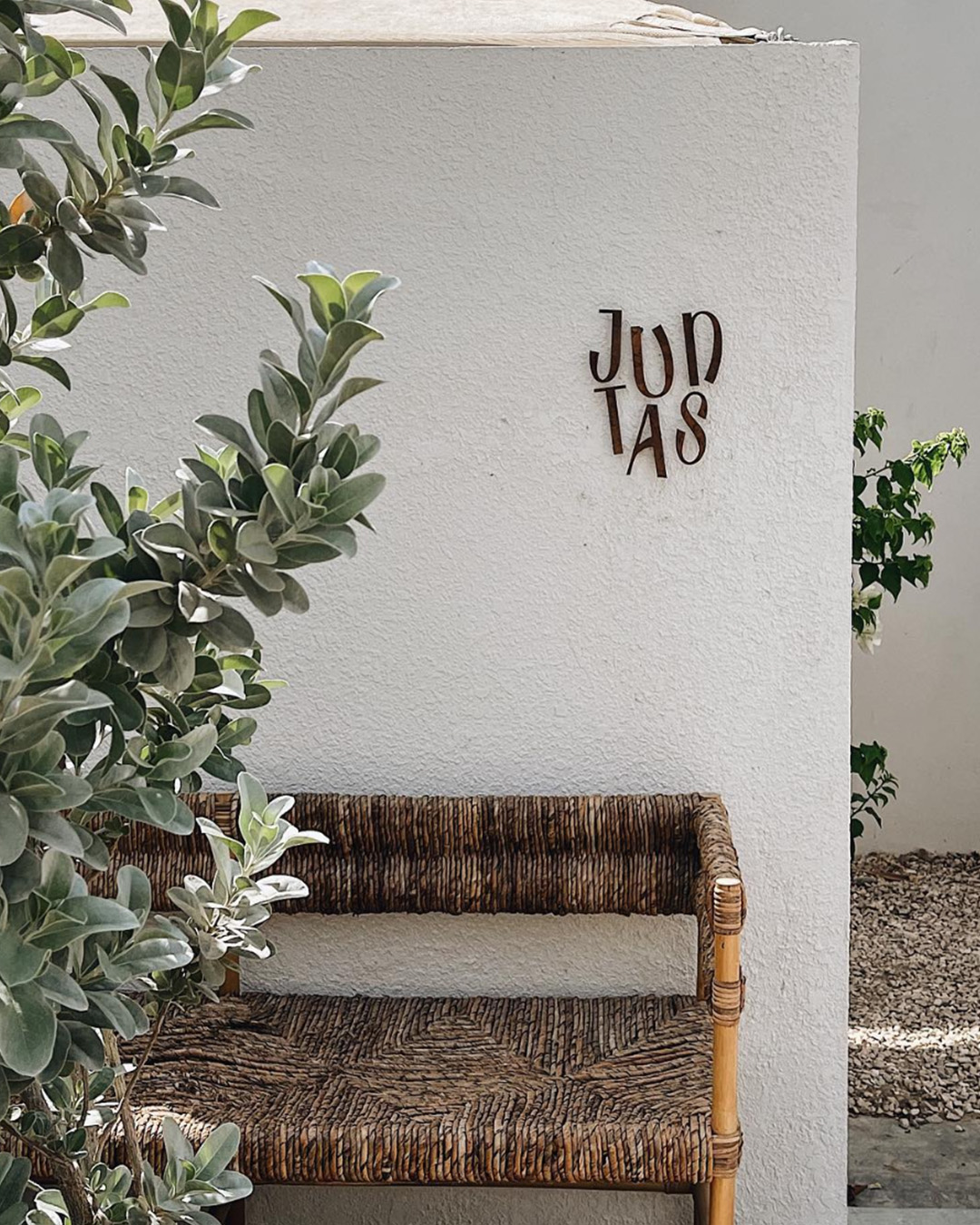
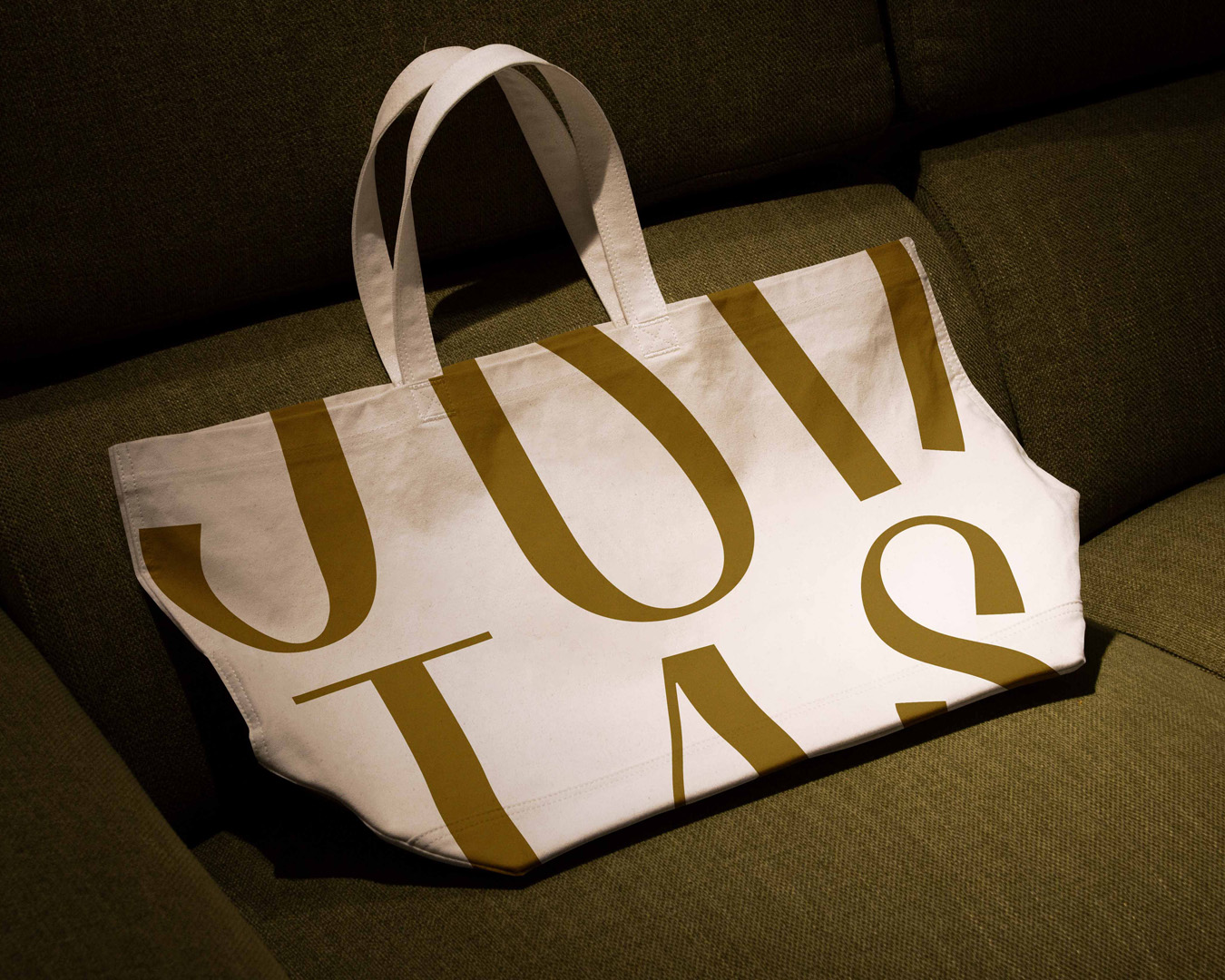
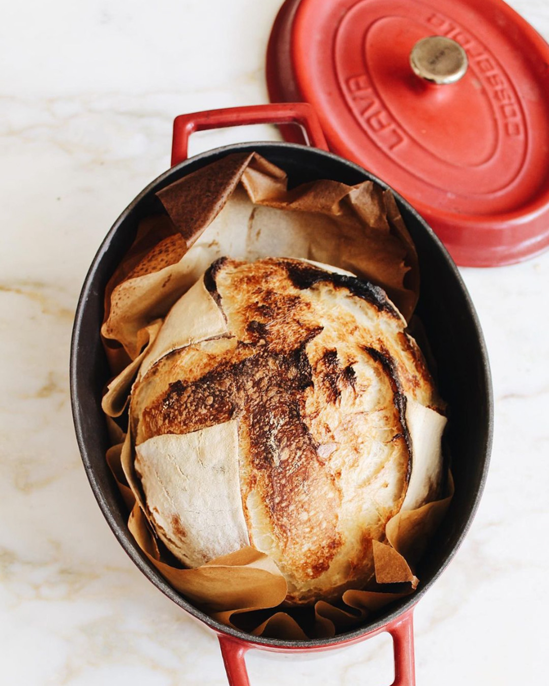
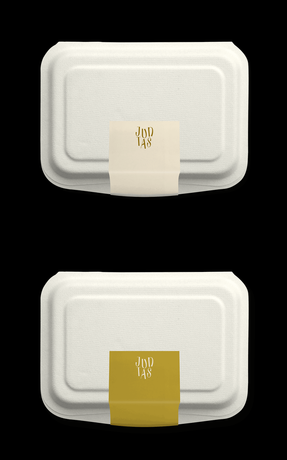
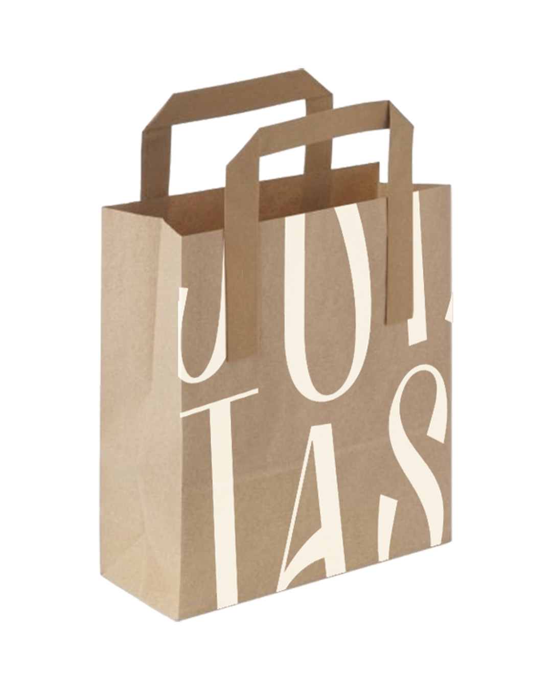
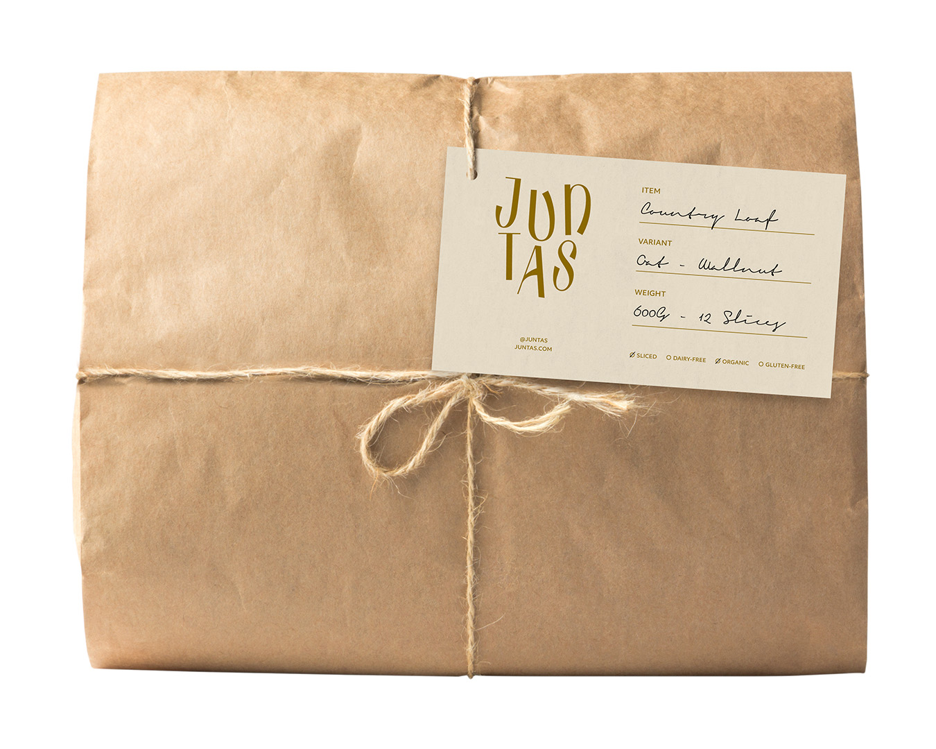
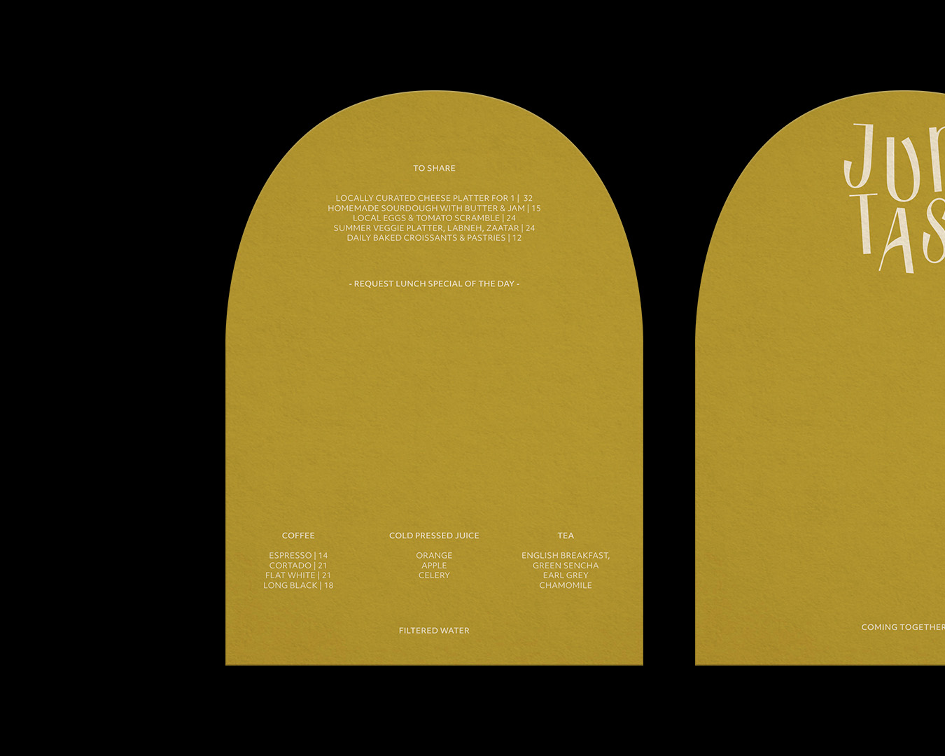
Juntas, a Portuguese word meaning ‘coming together,’ is the heartfelt creation of two passionate sisters deeply inspired by the Portuguese lifestyle. Nestled in the founders’ residence courtyard, Juntas is a humble neighborhood cafe that aims to bring the essence of good quality coffee, homemade sourdough bread, and freshly prepared bites to the nearby residents. The concept is driven by women, reflecting their dedication and vision. To embody the essence of the women-led concept, the logo of Juntas features a unique typeface designed by Gemma Mahoney. The carefully chosen color palette evokes a warm and inviting atmosphere, providing a subtle pop of color. The collateral materials embrace a playful and quirky application aligned with the friendly and approachable nature of the home-based business and the brand’s distinct personality.
[A]
[B]
[C]

[D]
[E]

[F]
[G]

[H]
[I]
[J]
[K]
