Brand Revisit
Hoof, 2019
Brand Revisit
F&B
Phase 1: Strategy & Positioning/ Phase 2: Visual Identity Development/ Phase 3: Brand Application & Collateral Design
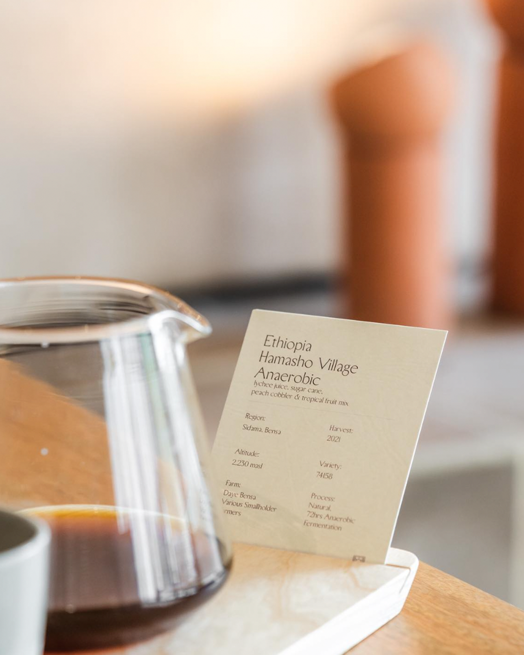
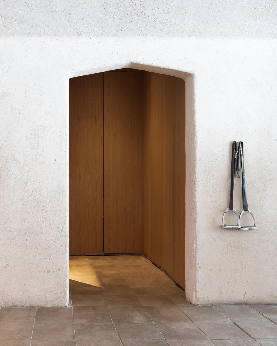
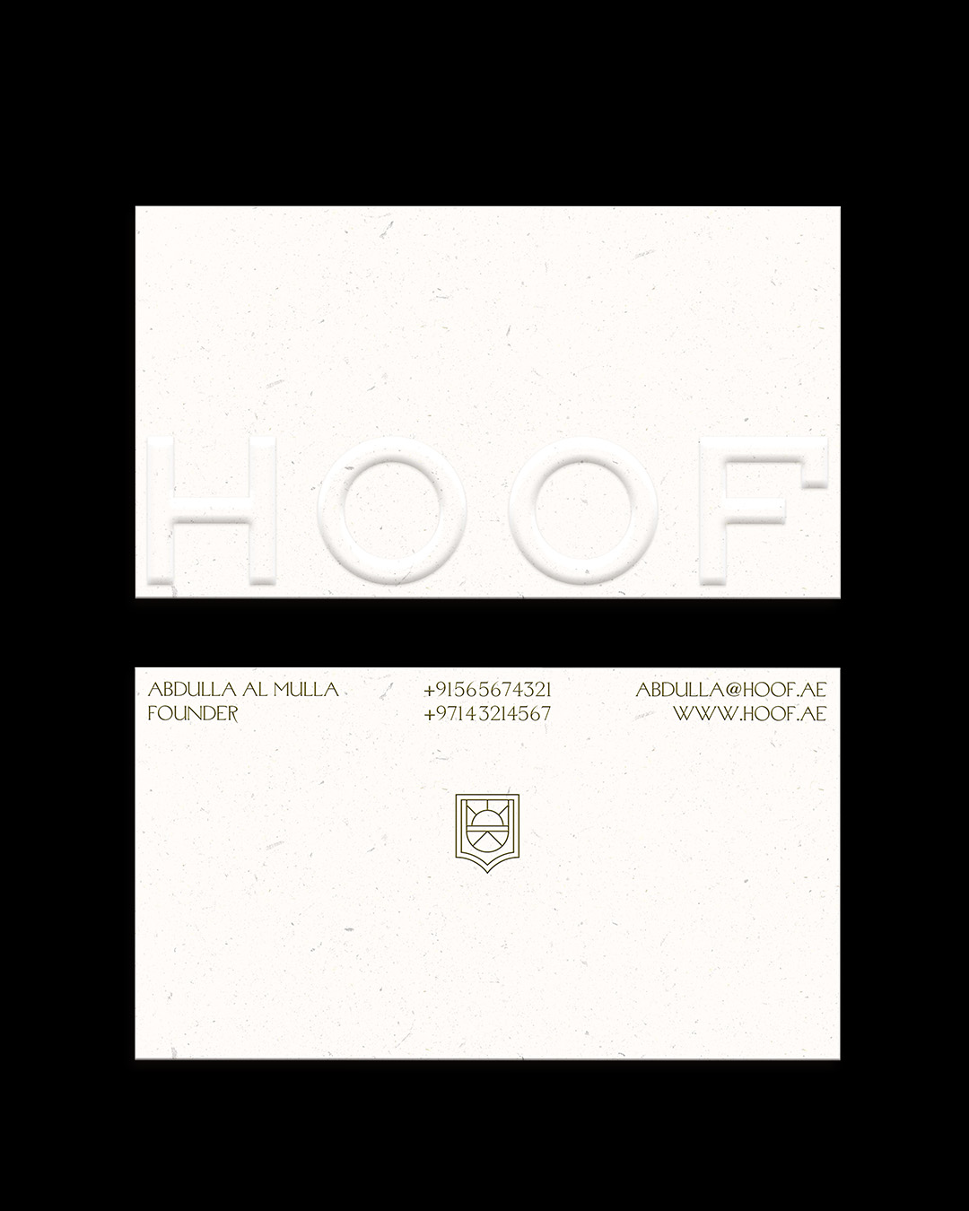
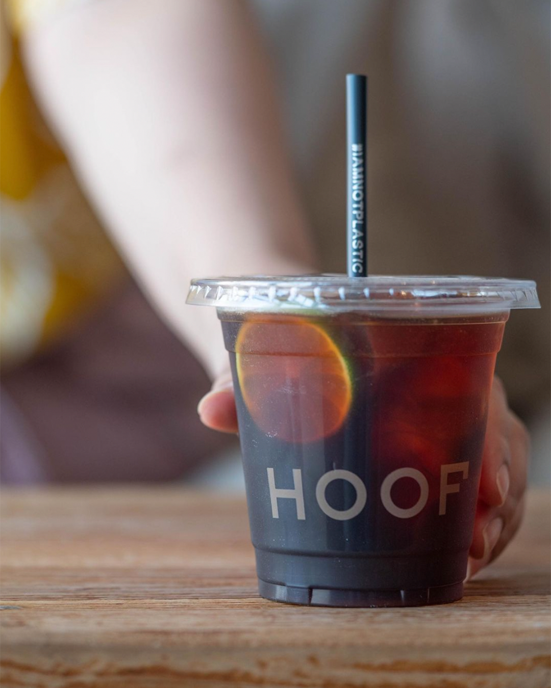
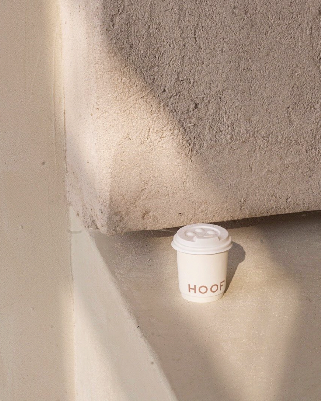
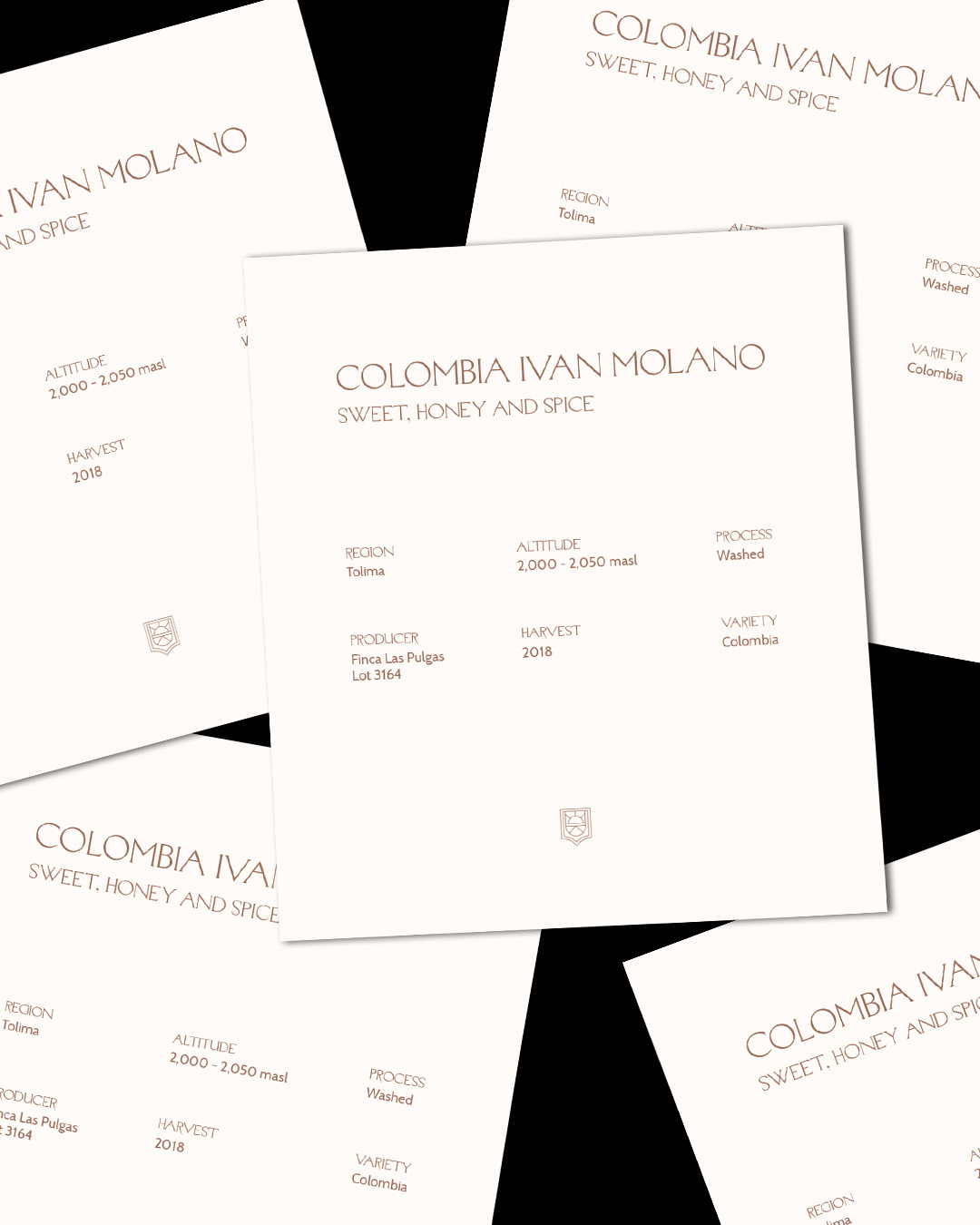
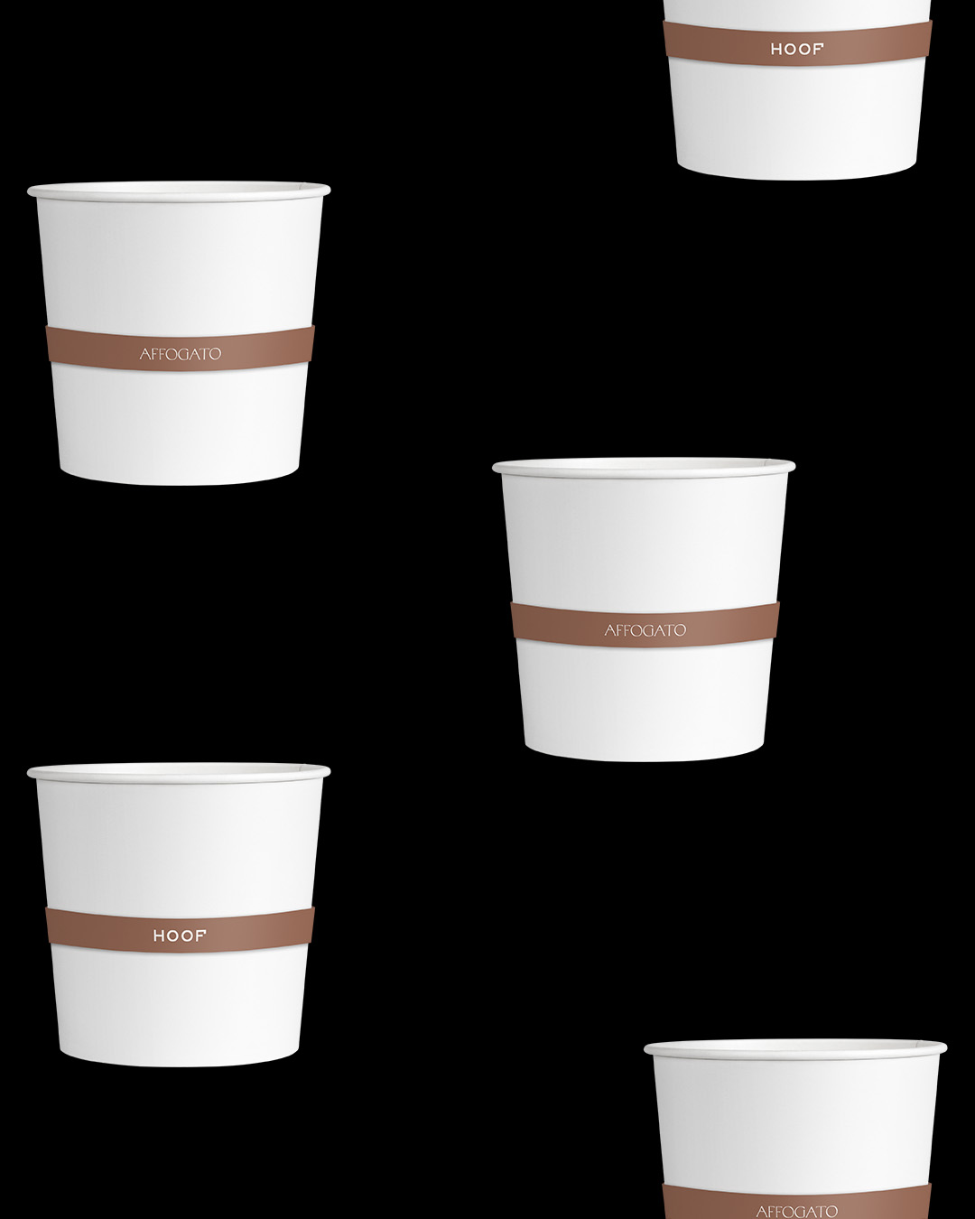
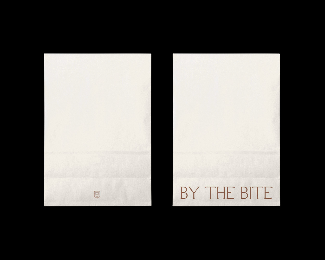
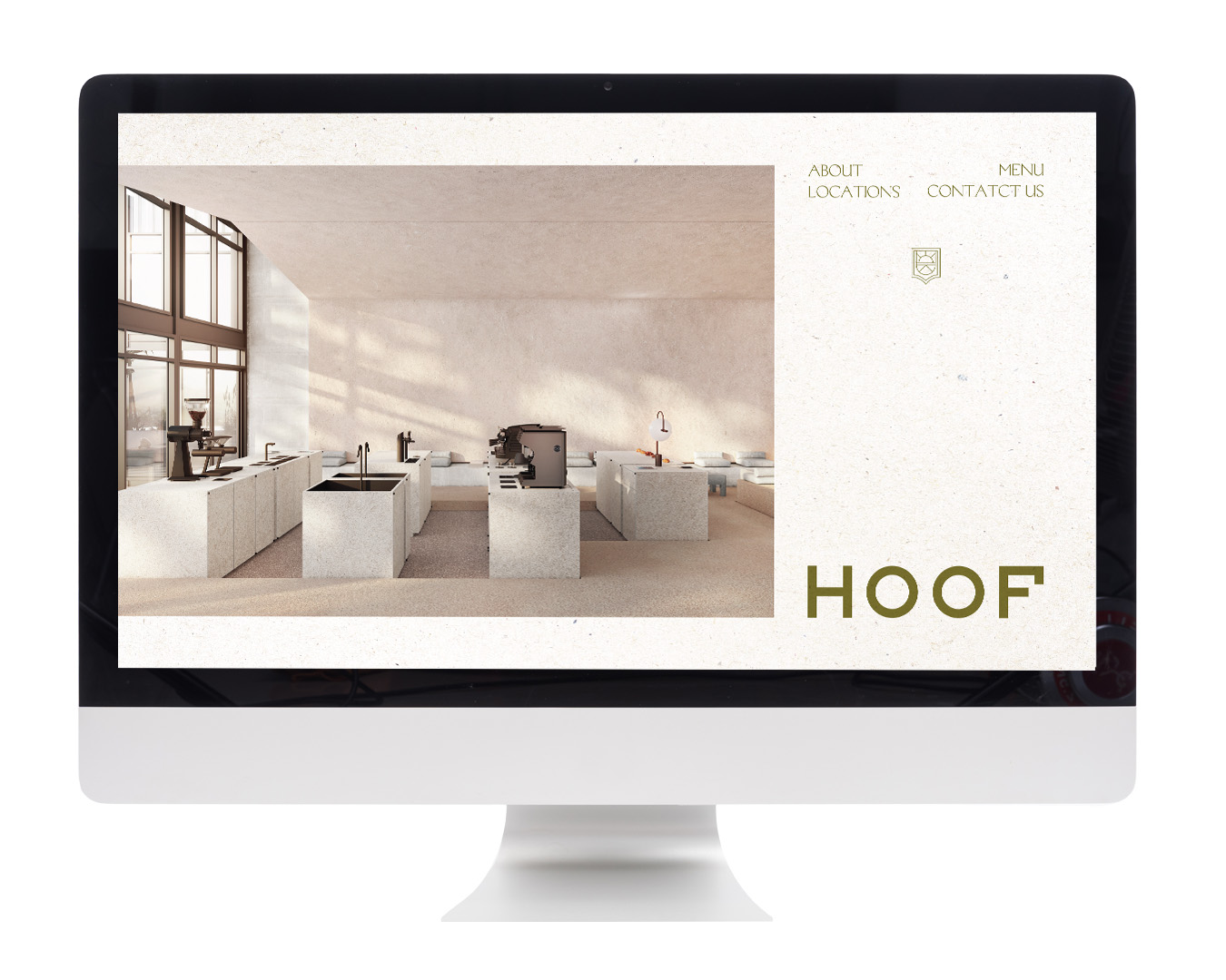
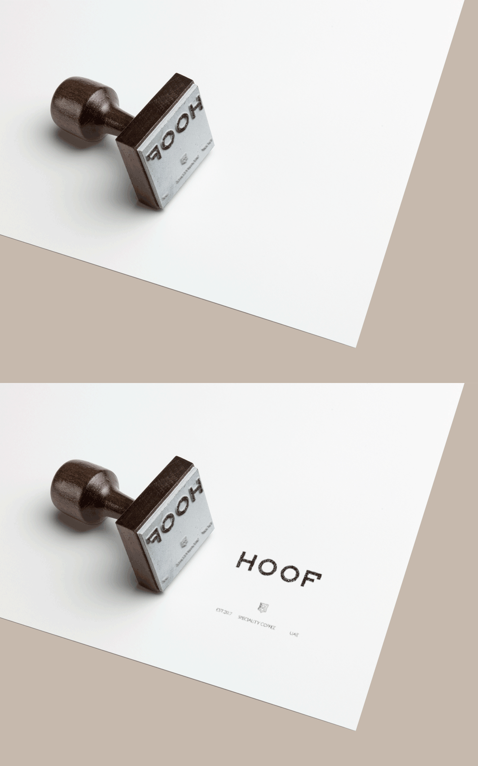
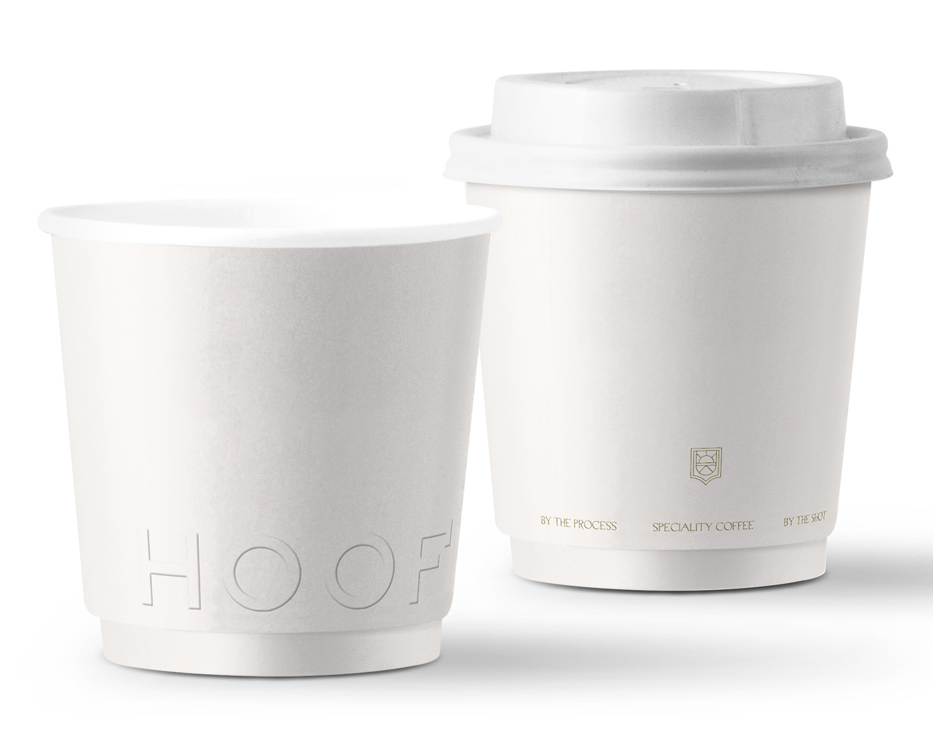
Hoof is a specialty coffee concept brought to life by three passionate equestrians. The brand identity elegantly embodies elements of equestrianism, creating a subtle connection to their shared passion. The refined logotype draws inspiration from the intricate shape of a horse’s hoof, while the color palette takes cues from modern horse saddles. The chosen brand type, “Manege,” refers to an enclosed area for horse training, further adding depth to the brand’s identity. Collaborating with Bone, the space design and all other brand elements seamlessly incorporate equestrian influences in a contemporary and understated manner.
[A]
[B]
[C]
[D]

[E]
[F]
[G]
[H]
[I]
[J]
[K]
[L]
